

How AI Development Rules Protect Color Accessibility

What you’ll learn
- Why light, dark, hover, selected, and focus colors must be checked as state combinations
- How to encode color criteria, purpose-named colors, and AI instructions in shared rules
- How to fix the states and targets that every diff review should inspect
Protect Color Accessibility with State-Based Rules
I initially expected a readable default color to be enough, but contrast and state cues repeatedly failed in dark mode, light mode, hover, selected, or focus states. Building this site through Vibe Coding—implementing through natural-language instructions to AI—showed me that color must be checked as combinations of theme and interaction state. I now encode those checks in a harness, the rules, procedures, and verification methods that guide AI work, while keeping automated checks separate from visual review.
By the end of this article, you will have practical criteria for answering “How can color defects across themes and interaction states be prevented before the next implementation?” in your own context.
The Problem Was Not One Color, But State Combinations
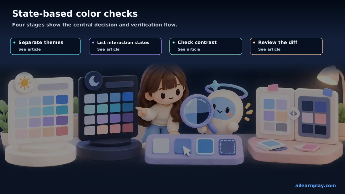
At first, I fixed individual colors: this button was too pale, or this selected card was hard to distinguish. Over time, I realized the real problem was not one color. It was the combination of state, theme, background, and text size.
For example, a component can look fine in the default light theme but lose contrast when hovered in the dark theme. A selected card can remain readable while its focus ring disappears into a shadow or background. Vibe Coding can produce a visually polished first draft quickly, but that does not mean every state has been checked.
WCAG 2.2’s minimum contrast criterion requires a contrast ratio of at least 4.5:1 for normal text and at least 3:1 for large text.[1] That makes color review more than checking one screenshot. The review has to combine state, theme, background, and text size.
Manual Review Alone Misses Repeated Color-State Checks
If I handle this only by memory, I have to remember the same checklist every time. As article cards, quizzes, sidebars, pagination controls, and tag links increase, the number of states to check increases as well.
Automated tools are useful, but W3C explains that accessibility evaluation tools cannot check every aspect automatically, human judgment is required, and tools can only assist in determining accessibility.[2] So the system I need is not “install one tool and stop.” It is a workflow that connects AI instructions, shared rules, purpose-named colors, diff review, and browser checks.
Put Color Criteria In Shared Rules
The first place I fixed the workflow was the implementation entry point. This site keeps component accessibility requirements in shared/rules/component-accessibility.md for components added or changed under src/components/.
The important part is that color should not be left to the AI’s one-off judgment. For new components, default, hover, focus, and selected colors should come from existing purpose-named CSS variables. Link-like and button-like UI should prefer --btn-ghost-*, choice and number badge UI should prefer --btn-choice-*, and round icon or number containers should prefer --topic-btn-icon-*.
That rule makes it less likely that AI will directly use --sl-color-accent or ad hoc color-mix() values for new interaction states. When existing CSS variables are not enough, the decision moves back to adding a purpose-named CSS variable first instead of hiding a new color inside one component.
Reuse Experimentation Through Purpose-Named Colors
src/styles/custom.css contains the CSS variables I use across light and dark themes for buttons, choices, topic icons, and pagination. Keeping them there lets one component fix inform the next implementation.
The state matrix I now care about looks like this:
| Area | States To Check | Harness Decision |
|---|---|---|
| Theme | Light / dark | Define the same purpose-named CSS variable in both themes |
| Interaction | Default / hover / focus | Review focus-visible and hover colors together |
| Selection | Unselected / selected | Separate selected-state CSS variables such as --btn-choice-* |
| Background | Card / sidebar / body | Compare against existing components with similar roles |
| Fix path | Local color / CSS variable addition | Give reusable colors a shared purpose name |
This table is not only for AI. It is also my own review checklist. The goal is not to remove human review. The goal is to make the review target consistent every time.
Write AI Instructions By State
Prompts such as “make it accessible” or “make it readable in dark mode” do not tell AI which states need to be checked.
Now I write the request by state:
Implement a new selectable card component.

Color and state requirements:
- Check both light mode and dark mode
- Define default, hover, focus, and selected states
- Prefer the existing --btn-choice-* CSS variables
- Do not add new color-mix() values directly
- Adjust normal text with WCAG AA contrast in mind
- Ensure the focus-visible outline is not hidden by backgrounds or shadows

After implementation, briefly report which CSS variable is used for each state and which states remain unverified.
The final “unverified states” report matters in Vibe Coding. AI may say the implementation is done, but unchecked states can remain. The completion report format is part of the harness because it prevents unverified states from being treated as finished work.
Review Theme, Interaction, and Selection Colors in the Diff
After implementation, I read the diff before checking the UI in the browser. For color accessibility, I focus on these points:
- A component does not introduce new state colors directly instead of using existing CSS variables
- The implementation does not cover only light mode or only dark mode
:hoveris not implemented without:focus-visible- Selected state is not communicated only by background color
- Focus rings are not hidden by shadows, borders, or background colors
- Visual state does not drift from
disabled,aria-selected, oraria-current
This is not fully automated in my current harness. npm run harness:check detects blog quality issues, repository-claim problems, duplicate content, and shared harness drift, but it does not visually judge every color combination. That is why I combine shared rules and diff review, separating what machine checks can catch from what I still need to inspect.
Summary: Move State-Based Color Checks Before the Next Implementation
This blog article is narrower. It focuses on the specific issue I repeatedly saw on this site: color and state combinations. The docs page gives the fundamentals. This blog records the concrete problem and the harness-building iteration behind it.
Preserving accessibility in UI created through Vibe Coding takes more than asking AI to choose good colors. Light mode, dark mode, default, hover, focus, and selected states need to be reviewed together.
The harness I am building follows this pattern:
- Put color criteria in
shared/rules/component-accessibility.md - Prefer purpose-named CSS variables in
src/styles/custom.css - List states explicitly in AI prompts and ask for unverified states
- Review diffs for direct color values, one-theme-only changes, and missing focus states
- Separate automated checks from manual review instead of treating machine output as completion
To keep the speed of Vibe Coding, I cannot rely on remembering the same issue after it appears again. I need to turn each repeated failure into something the next implementation can read before the same state is missed. That is the practical role of a color accessibility harness.
The first action is to choose one frequently used UI component and list the light, dark, hover, selected, and focus combinations that need review. Automated checks cannot judge every aspect of color meaning and perception, so inspection of the rendered interface must remain a human review step.
References
- W3C, Web Content Accessibility Guidelines (WCAG) 2.2, December 12, 2024
- W3C Web Accessibility Initiative, Selecting Web Accessibility Evaluation Tools, updated May 13, 2024
For the latest releases and updates, check the official website and official documentation.